HDR - I'm not getting what I want

ImageImageDedicated forum for all your questions, remarks etc about (aviation) photography, digital as well as old fashioned film.

Forum rules
ImageImage
Post Reply
User avatar
Iwan Bogels
Scramble Addict
Scramble Addict
Posts: 2385
Joined: 06 Sep 2002, 06:59
Subscriber Scramble: Iwan Bogels
Location: N 52°13"31.2 E 4°29"57.5
Contact:

HDR - I'm not getting what I want

Post by Iwan Bogels »

Hi guys,

Over the pas few weeks I have been playing with HDR. All the time I work with Photomatix 3.2 and Photoshop CS4, but I had the feeling something was not going as I intended. Today I found out what it was, but now I'm looking for a way to tackle the problem. Hopefully somebody has the answer, as I'm bit lost here......

This is what happens:

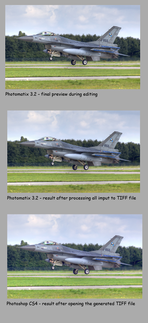
1. I import all images into Photomatix 3.2 and change all the setting in a way that the preview shows my photo the way I want it to look.

2. I hit the "process" button and let Photomatix apply all my settings to generate a TIFF-file.

3. I open the newly generated image in Photoshop CS4 to post process it for publication.

Every time I had a feeling that my Photomatix preview was not identical to what I got in Photoshop, and today I discovered I was right. Below you can see three sequential screen shots of each individual part of the process, and you will clearly notice the difference. The first image is how I want my photo to be. The second image is a bit lighter and less powerful (in dutch: fletser). The third image looks horrible with different grass color and strange lighting, and a total lack of dynamic power.

The only steps I took between image 1 and 3 were: Hit the process button, save the image and open it again in Photoshop. What can go wrong I would think.....

Any suggestions ???

Cheers,
Iwan

Image
Last edited by Iwan Bogels on 08 Mar 2010, 14:19, edited 1 time in total.
Fox2 - for everything about low flying in Wales........and more !!

Image
User avatar
Herbertvh
Scramble Senior
Scramble Senior
Posts: 385
Joined: 06 Sep 2002, 00:02
Contact:

Re: HDR - I'm not getting what I want

Post by Herbertvh »

Hi Iwan,

This looks like a colour space problem to me. Which colour spaces are you using during the process, and which do you intend to use? Check your colour space properties in both Photomatix and PhotoShop.

Cheers,
Herbert
Enjoy!
tonno1970
Scramble Senior
Scramble Senior
Posts: 409
Joined: 18 Jul 2005, 12:22
Location: Pordenone

Re: HDR - I'm not getting what I want

Post by tonno1970 »

Herbertvh wrote:Hi Iwan,

This looks like a colour space problem to me. Which colour spaces are you using during the process, and which do you intend to use? Check your colour space properties in both Photomatix and PhotoShop.

Cheers,
Herbert
+1 (even if I don't even know how to prcocess an HDR)
User avatar
Iwan Bogels
Scramble Addict
Scramble Addict
Posts: 2385
Joined: 06 Sep 2002, 06:59
Subscriber Scramble: Iwan Bogels
Location: N 52°13"31.2 E 4°29"57.5
Contact:

Re: HDR - I'm not getting what I want

Post by Iwan Bogels »

Thanks Herbert and Tonno,

I have been testing, with various results. And before I continue to tell about my experiences and problems, I wonder what you guys see.

Below you see three images, all coming from the exact same photo. I have been trying to mix and match various color profiles, and have found one combination that comes close to how I want it to look. But as all (uncalibrated) screen look different, I wonder which of the following three images you think looks best ?

Please let me know, and I will share more info later this week.

Thanks,
Iwan


Image

Image

Image
Fox2 - for everything about low flying in Wales........and more !!

Image
User avatar
Herbertvh
Scramble Senior
Scramble Senior
Posts: 385
Joined: 06 Sep 2002, 00:02
Contact:

Re: HDR - I'm not getting what I want

Post by Herbertvh »

Hi Iwan,

To me it looks like they are in order from best to least well:

1. Seems to have the most contrast and dynamic range. You can almost identify individual clouds. Grey shades are most vidid as you will see on the three pictures. Greens look mostly ok, with the right amount of blue.

2. Has a bit less contrast. Individual clouds are harder to identify, definately worse than in previous shot. Greys are more dull, just like the greens. It doesn't have the punch the previous shot has. Actually, I think the greens are a little bit off; there is too much yellow in the picture. It looks less sharp as well, which is what you can expect if too much yellow is introduced (meaning it is probably as sharp as the previous one, but the "perceived" sharpness is less).

3. Least contrast of all. Individual clouds are even harder to identify than in previous shots. Greys are more dull. Greens are even more off, with even more yellow than found in the other shots.

For all three, I think it would be better if they were just a tad darker. They are not yet overexposed, but darkening them a little bit will make the colours come out better. Also, if you look closely, it looks like a HDR halo is starting to develop right under the main landing gear.

I'm really interested to hear what you found out on the colour profiles.

Herbert
Enjoy!
User avatar
Herbertvh
Scramble Senior
Scramble Senior
Posts: 385
Joined: 06 Sep 2002, 00:02
Contact:

Re: HDR - I'm not getting what I want

Post by Herbertvh »

And as a side remark, you're telling you've mixed and matched several colour profiles to find the best result. I suppose you know that you're not supposed to work that way, but you should stick to the same (as wide as possible) colour profile for the whole editing process instead. With just a conversion to the final colour profile as one of the very last steps . . .

But I guess you've been mixing and matching just to see what effect it will have on the picture, right?
Enjoy!
tonno1970
Scramble Senior
Scramble Senior
Posts: 409
Joined: 18 Jul 2005, 12:22
Location: Pordenone

Re: HDR - I'm not getting what I want

Post by tonno1970 »

If we speak about details Herbertvh is probably right, but I prefer them in this order:

3 is the one looking more "real" to my eyes and the best of the bunch for exposition.
1 very close but for example the runway surfaces seems a bit on the magenta side (just if I must look for something wrong...)
2 a bit overexposed and "flat"

Obviously I am speaking about minor defects and looking to my non calibrated monitor at job.
User avatar
Spooky
Scramble Junior
Scramble Junior
Posts: 223
Joined: 03 Jun 2003, 23:49
Subscriber Scramble: Spooky
Location: Close enough

Re: HDR - I'm not getting what I want

Post by Spooky »

He Iwan,

Looking at your last set, I must say I like the third one best. The others seem to have a reddish color. Anyhow I cannot see the HDR effect really, they look just very well exposed and adjusted in PS/LR.

Ciao,
Anno
User avatar
Iwan Bogels
Scramble Addict
Scramble Addict
Posts: 2385
Joined: 06 Sep 2002, 06:59
Subscriber Scramble: Iwan Bogels
Location: N 52°13"31.2 E 4°29"57.5
Contact:

Re: HDR - I'm not getting what I want

Post by Iwan Bogels »

Hi Herbert, Giampaolo and Anno,

Thanks for sharing your opinions. I hope more people will let me know what they see in THEIR screen.

It's interesting to see your remarks, which give me a very clear reference to what I see myself. Tonight I will return home (after being away for a few days), and hopefully I will have some spare time to show you more photos and information.

To me it's an interesting topic, and I hope more people will reply.

More to come,
Iwan
Fox2 - for everything about low flying in Wales........and more !!

Image
User avatar
Iwan Bogels
Scramble Addict
Scramble Addict
Posts: 2385
Joined: 06 Sep 2002, 06:59
Subscriber Scramble: Iwan Bogels
Location: N 52°13"31.2 E 4°29"57.5
Contact:

Re: HDR - I'm not getting what I want

Post by Iwan Bogels »

Spooky wrote:Anyhow I cannot see the HDR effect really, they look just very well exposed and adjusted in PS/LR.
Hey Anno,

I just returned home and don't have time to write the full story yet, but I can comment on your HDR-remark as quoted above.

Below you will find two images of the same photo. The first one is the original image that was used for my HDR-photo. It is the neutral lighted version (I also used the same shot with +2, +1, -1 and -2 stops over and under exposure) without too many Lightroom adjustments. The second photo is the HDR-result from Photomatix 3.2. Can you spot the HDR-result now ?


Without HDR
Image


With HDR
Image

Although I love some of the exaggerated HDR-shots, I prefer to make the images more lively without going "over the top". Judging by your remark, it seems I did just right on this particular HDR-shot.

More about the colors later.

Cheers,
Iwan
Fox2 - for everything about low flying in Wales........and more !!

Image
User avatar
Herbertvh
Scramble Senior
Scramble Senior
Posts: 385
Joined: 06 Sep 2002, 00:02
Contact:

Re: HDR - I'm not getting what I want

Post by Herbertvh »

Hey Iwan, I'm still curious about your findings. Please let us know.

Thanks,
Herbert
Enjoy!
User avatar
Andras
Scramble Addict
Scramble Addict
Posts: 1108
Joined: 20 Jul 2008, 11:18
Type of spotter: Photo only
Location: Bearing 210 from EHLW 70 NM
Contact:

Re: HDR - I'm not getting what I want

Post by Andras »

Iwan, for your first set i see the following (Calibrated monitor)

Best is 3. Best contrast and grass is the more natural color here

Other two are identical for me, maybe some diff in the green grass... greener or blue-er. But it is a super tiny diff in these two for me...

HDR effect is great on this image, wall material..
Groet,

Andras Brandligt
My images at AirTeamImages.com
Post Reply

Return to “Photography”